
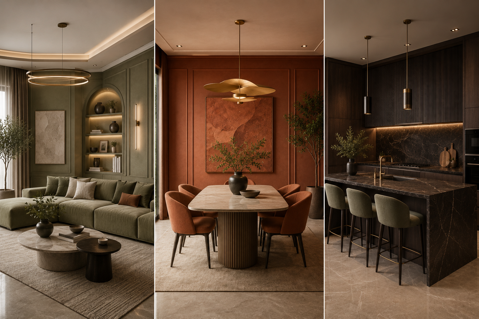
Interior Color Palette 2026: Sage Green, Terracotta & Espresso Trends
The interior color palette 2026 homeowners are choosing marks a clear shift away from stark greys and pure whites, moving instead toward warm, earthy tones that feel grounded and lived-in. For years, minimalist interiors leaned on cool, clinical shades to look modern. That trend is fading fast people now want homes that feel calm and personal, and color is doing most of that work.
Three shades are leading this shift: sage green, terracotta, and espresso brown. Together, they form one of the most cohesive color stories in Indian interior design right now.
What defines Interior Color Palette 2026 Trend
Unlike past trends that leaned on a single “statement” color, the interior color palette 2026 approach is about balance. It pairs a muted green, a warm clay tone, and a deep brown to create rooms that feel layered rather than matchy. All three shades sit close together on the color wheel in warmth and saturation, so they blend instead of competing.
Sage Green: The New Neutral
Sage green has quietly replaced beige as the “safe” neutral for walls, soft furnishings, and cabinetry. It pairs well with natural wood tones, brass or matte gold hardware, and off-white trims. Use it on an accent wall or upholstery if you’re not ready to repaint a whole room.
Terracotta: Warmth Without Overwhelm
Terracotta brings warmth without the visual weight of a bold red or orange. It works well in living room accents like cushions and vases, kitchen backsplashes, and balcony flooring or planters. Because it has natural, earthy roots, it complements sage green rather than competing with it.
https://britishpaints.in/blogs/terracotta-sage-green-trending-wall-paint-colour-ideas-for-2026/
Espresso Brown: Grounding Bold Spaces
Espresso brown anchors the palette. Too much sage and terracotta together can feel light and unstructured; espresso brown grounds the space through furniture, flooring, or door and window frames. A little goes a long way even one or two pieces can balance a lighter room
How to Combine This Color Palette in One Room
A simple formula that works in most homes:
60% neutral base — off-white, cream, or light sage walls
30% secondary tone — terracotta soft furnishings, tiles, or accent walls
10% grounding tone — espresso furniture or trim details
If your room already has a false ceiling design with cove lighting, these earthy tones work especially well underneath warm-toned LED strips, which enhance the terracotta and espresso shades rather than washing them out.
Color Palette Mistakes to Avoid
Using all three tones at equal intensity instead of picking one dominant, one secondary, one accent
Ignoring natural light , north-facing rooms need warmer undertones
Pairing with cool-toned metals like chrome or silver, which clash with this palette
Overusing terracotta on large surfaces instead of as an accent
Final Thoughts
The interior color palette 2026 trend works because it builds a warm, cohesive story using three tones that naturally complement each other. Starting with the 60-30-10 balance is the easiest way to bring the trend into your space without it feeling like a passing fad. At DivineSpace, this is a balance we apply on real projects, not just as a color theory exercise , knowing how these tones behave in actual Indian light and materials is what separates a good palette on paper from one that works in a finished room.

 Upper Ground Floor, Ascott Ireo City Central, Sector 59, Gurugram, Haryana

